

Can you talk a bit about your own artistic process? Referring to a few pieces in the JCCC show, can you please talk about your own creation process? Can you please go into some detail about what the pieces mean to you too?
Medium: Watercolour on Arches watercolour paper
Dimensions: 22”x 30”
Date: 2013
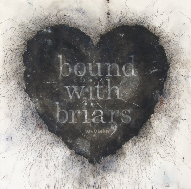
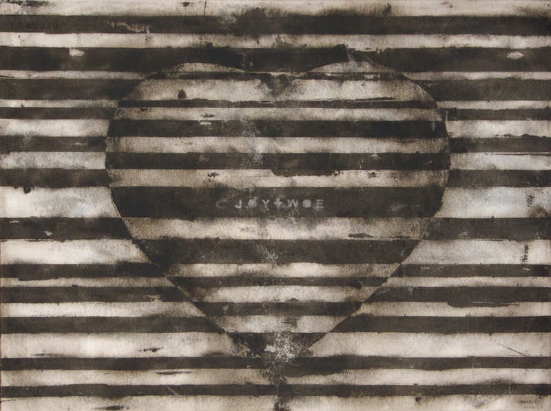
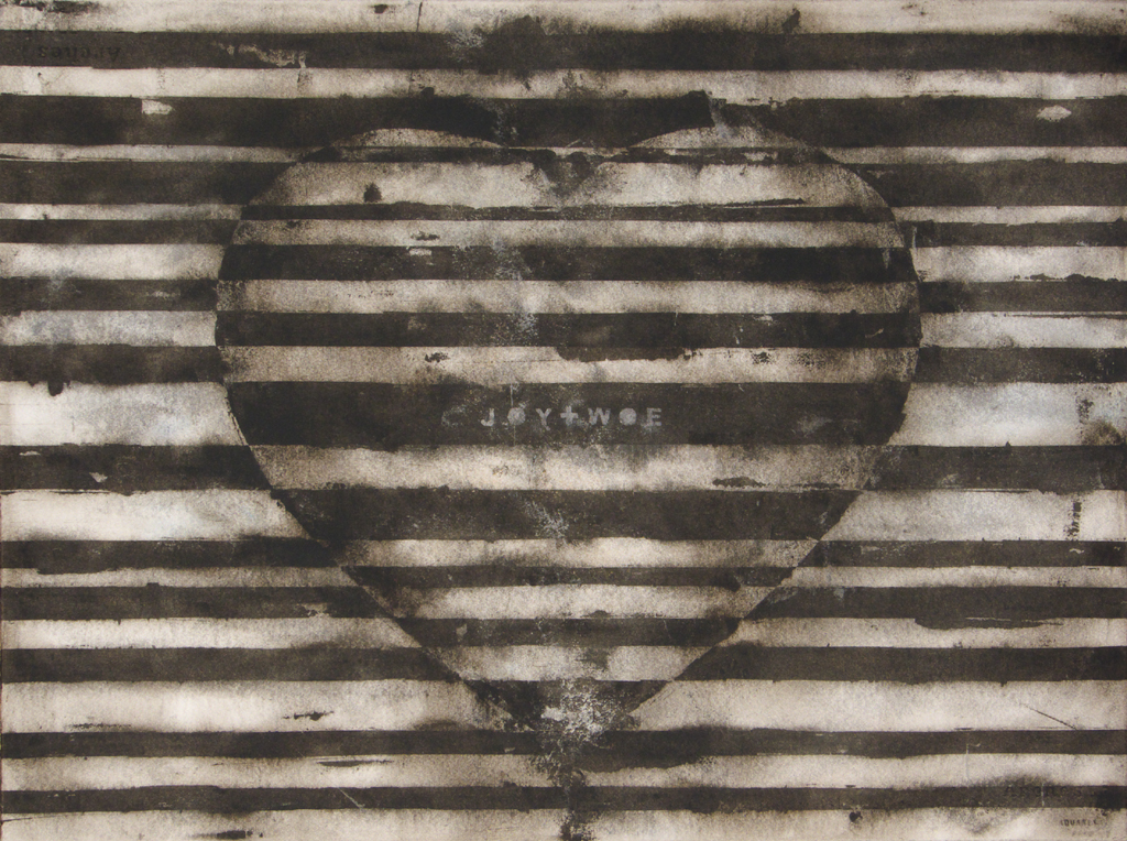
I like to look for commonplace objects and symbols to work with. Almost everything has possibilities and it is up to me as an artist to see them. Through a process of experimentation, contemplation and manipulation, the mundane can be made into art. For example, I have a series of work based on the symbol of the heart. That symbol is used everywhere and has become very constricted in its meaning, that being to like or love something. By adding text and other elements, I wanted to add nuance and depth to a tired symbol. In the work Briars I quote William Blake’s poem about religious repression (image 2). Image 3 has the text JOY+WOE.
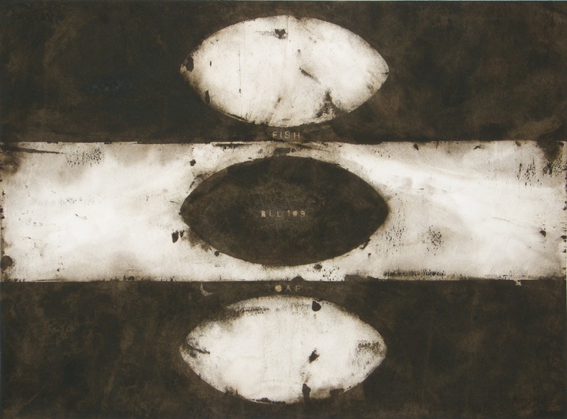
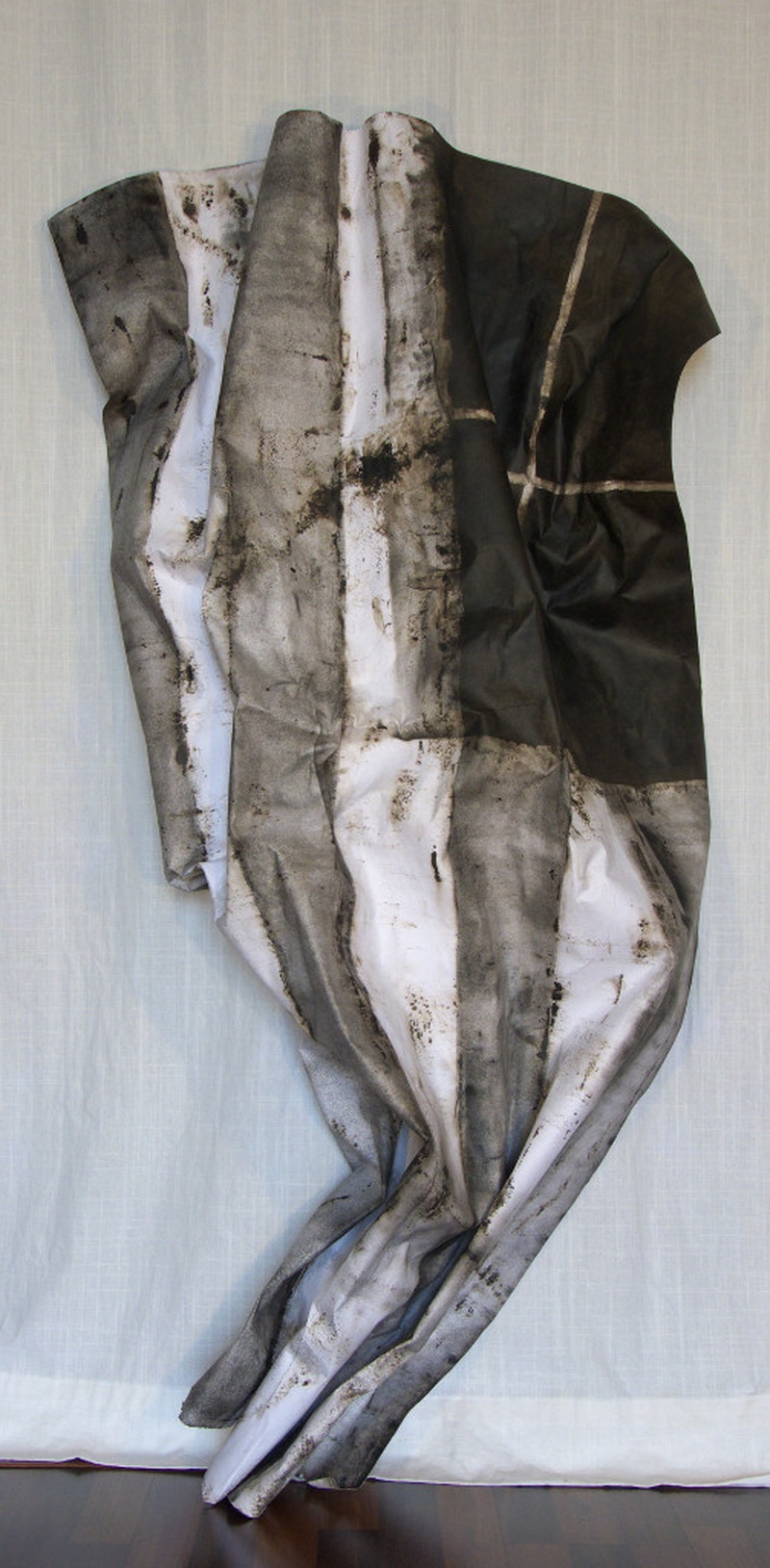
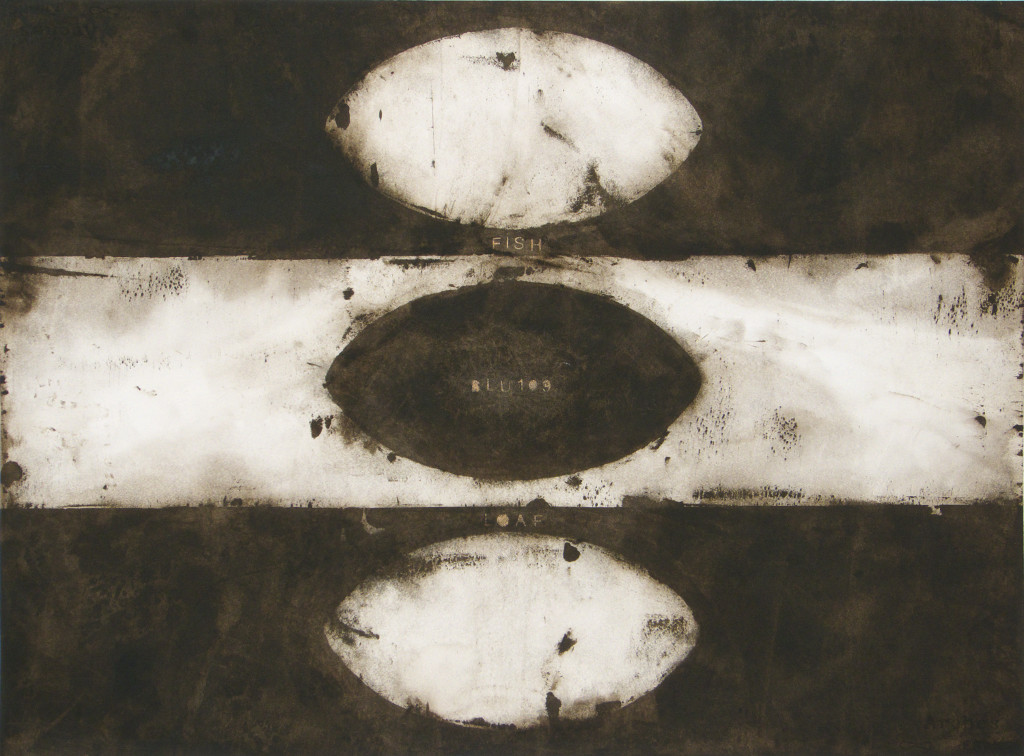
For the JCCC Gallery exhibition, which was organized and curated by Bryce Kanbara and in which I was partnered with the accomplished washi artist Heather Midori Yamada, the flag was the organizing idea. I had been working with flag-like images paired with text for a number of years. The strong graphic nature of flags, typically composed of stripes and geometric shapes, appealed to me from a visual standpoint. Culturally, of course, flags can have great meaning and emotional value. Image 4 is an example of my early flag work. It is entitled Miracle and references the Bible story of the loaves and fishes in which Jesus was able to miraculously feed the multitude. The painting has the words FISH and LOAF on the top and bottom. In the middle is the text “BLU109”. That is the name of a modern technological marvel, a bunker-busting bomb claimed to be able to penetrate 6 ft. of reinforced concrete.
Medium: Watercolour on Arches watercolour paper
Dimensions: 22”x 30”
Date: 2012
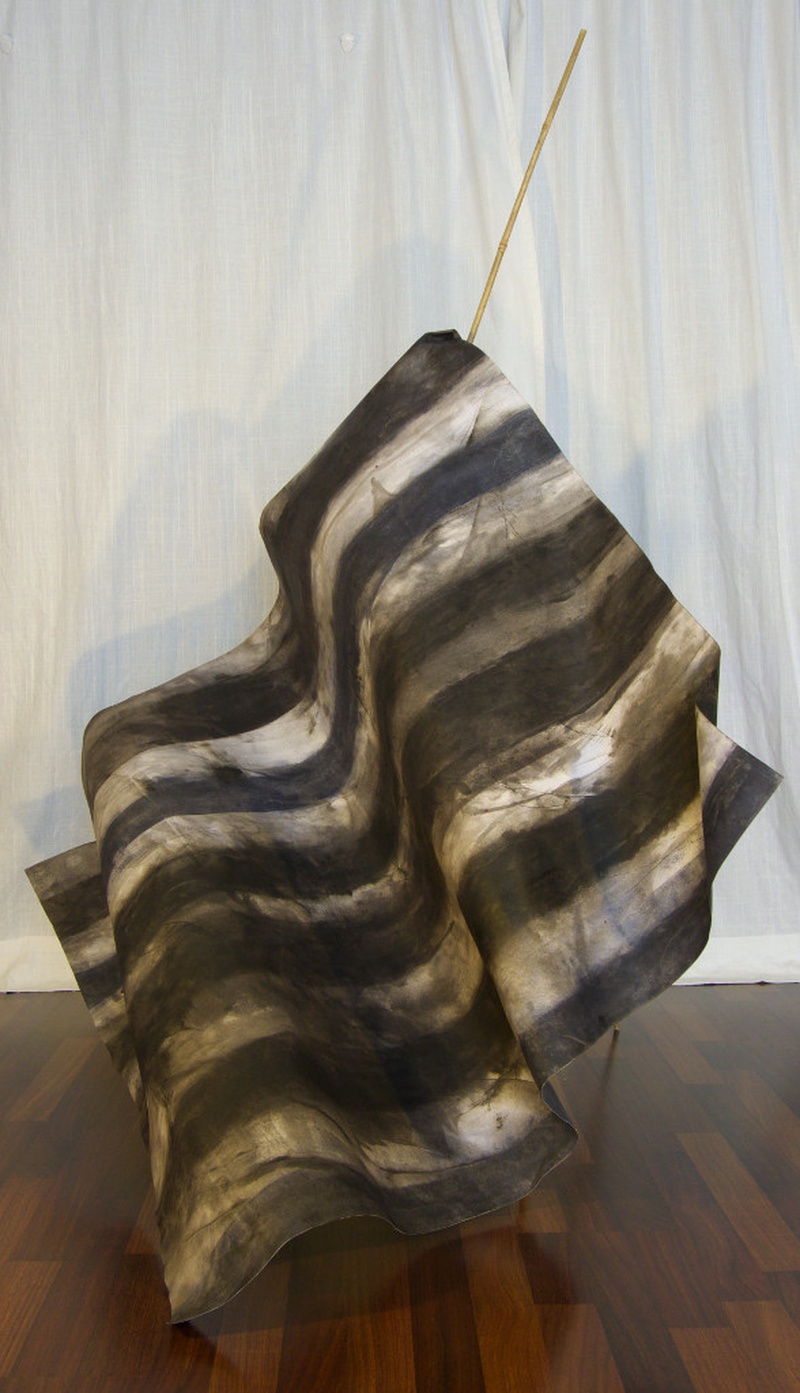
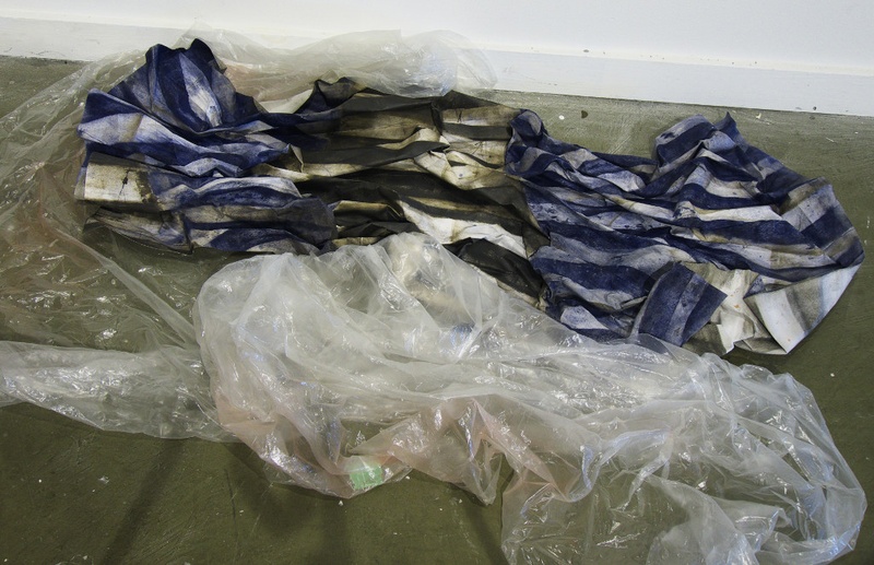
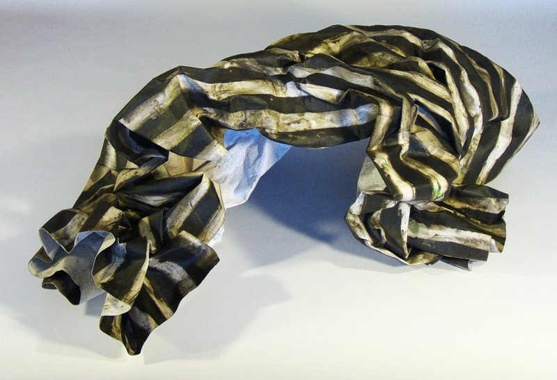
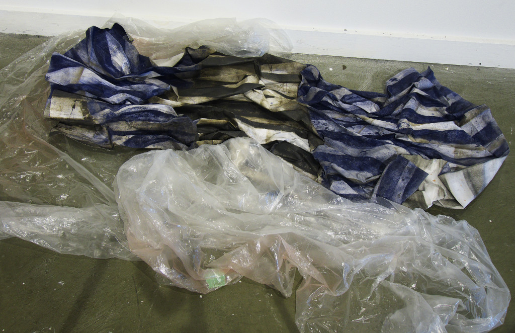
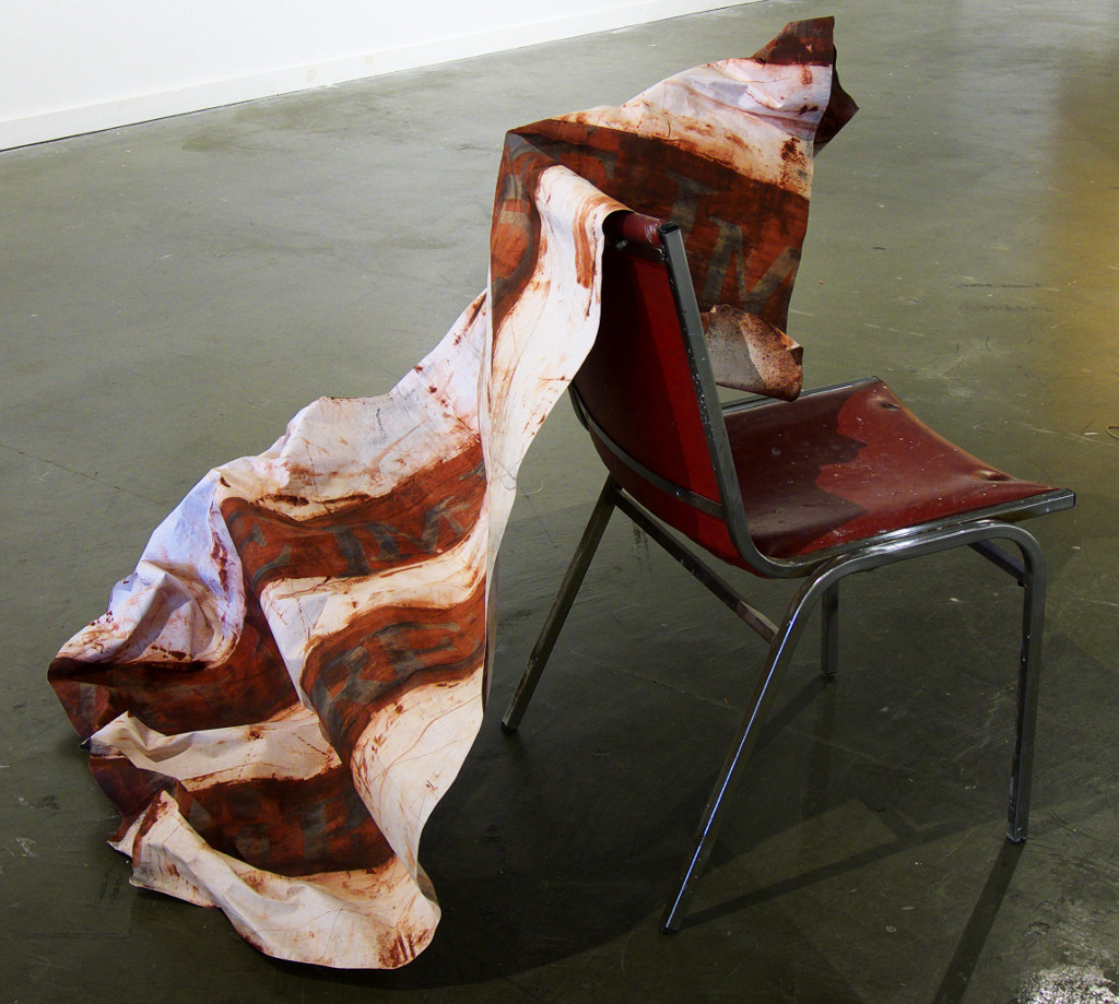
The flags in the JCCC Gallery exhibition can be viewed as flowing, folded, crumpled and contorted. They can be considered to be in the midst of rising into the air, falling and caught on sticks and furniture or discarded on the ground. Images 5-10 illustrate some of this.
Mixed Media: Watercolour on shaped engineered paper, plastic sheet
Dimensions: variable
Date: 2016
I wanted the flags to be a visual representation of the convoluted thinking as well as the desperation of people and societies under mounting pressure from environmental degradation, rampant disease, terrorist attack and fear of outsiders to name but a few modern concerns. The symbol of the flag can embody pride and hope for the future but also exclusionary forms of nationalism such as in the desire for racial purity.
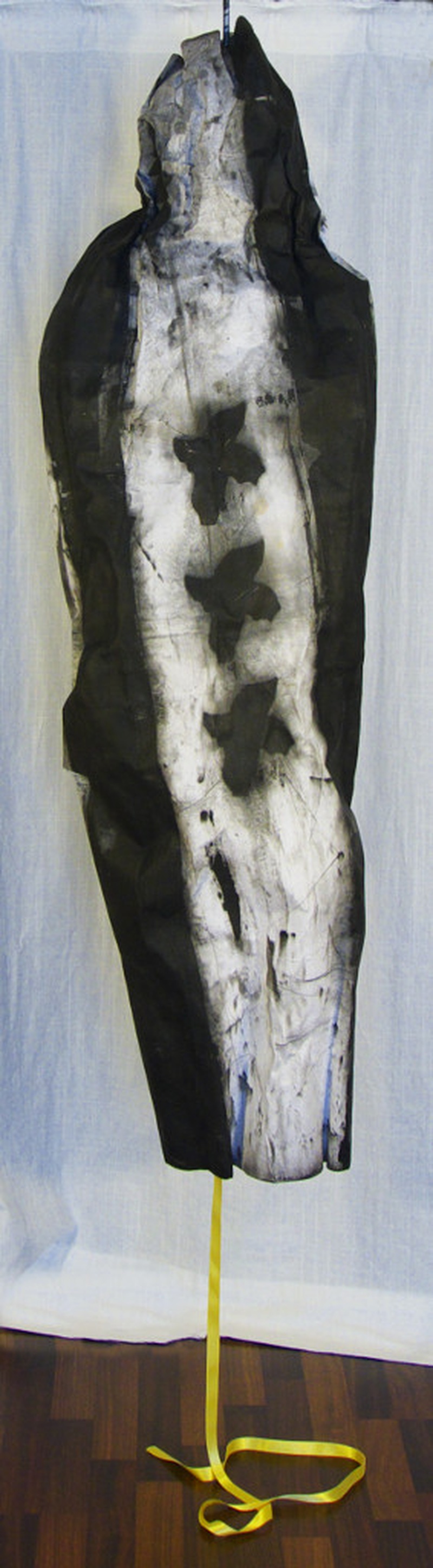
Image 11, entitled I’m Pure/Impure, is a text piece with the word impure printed multiple times on two red stripes. The viewer could read the same text, as the title implies, in two ways. The work is meant to address questions of inclusion exclusion.
Mixed Media: Watercolour on shaped engineered paper, chair
Dimensions: variable
Date: 2017
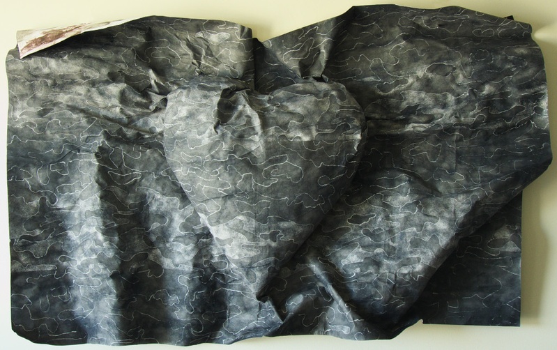
The low relief wall piece entitled Conceal (image 12) features a heart with a camouflage pattern background. It implies that sometimes beliefs and intentions have to be hidden.

Medium: Watercolour on shaped engineered paper
Dimensions: Approx. 41” H x 50” W x 9” D
Date: 2017

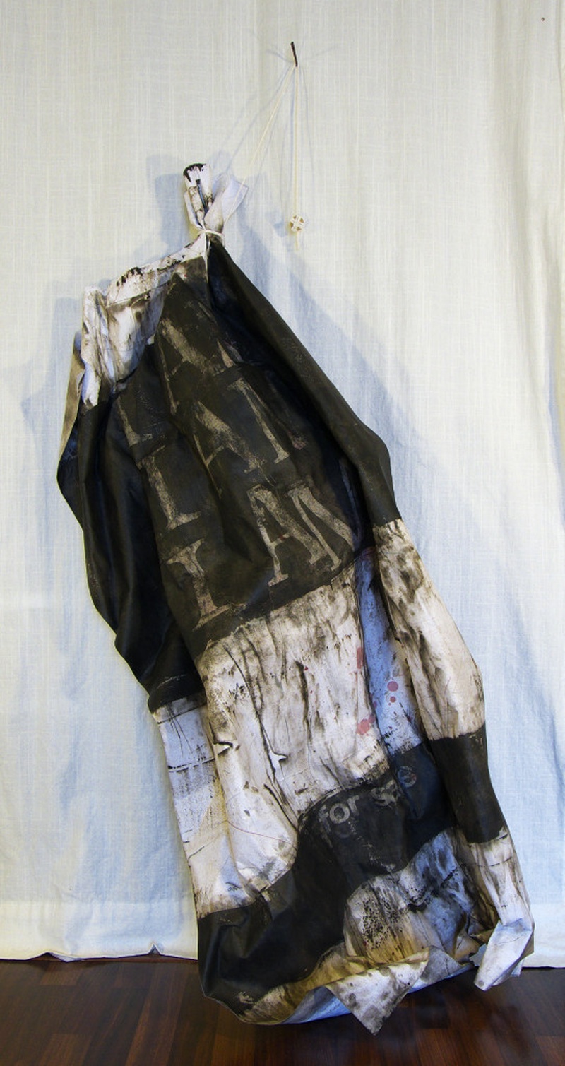
Mixed Media: Watercolour on shaped engineered paper, string, cut nail, dollar coin
Dimensions: variable
Date: 2017
Sale (image 13) hangs off of a nail and is counterbalanced by a dollar coin wrapped in string. In large letters the words “I am” are repeated three times. Lower in the sculpture and in smaller letters are the words “for sale”. With the first part of the text, I meant this as an affirmation of one’s existence but as I was thinking about the work I happen to read an article written by Filipino-American writer Alex Tizon in which he described the life of his family’s nanny and servant whom, by most definitions, would have been considered a slave. I decided to try to capture both situations in one piece.
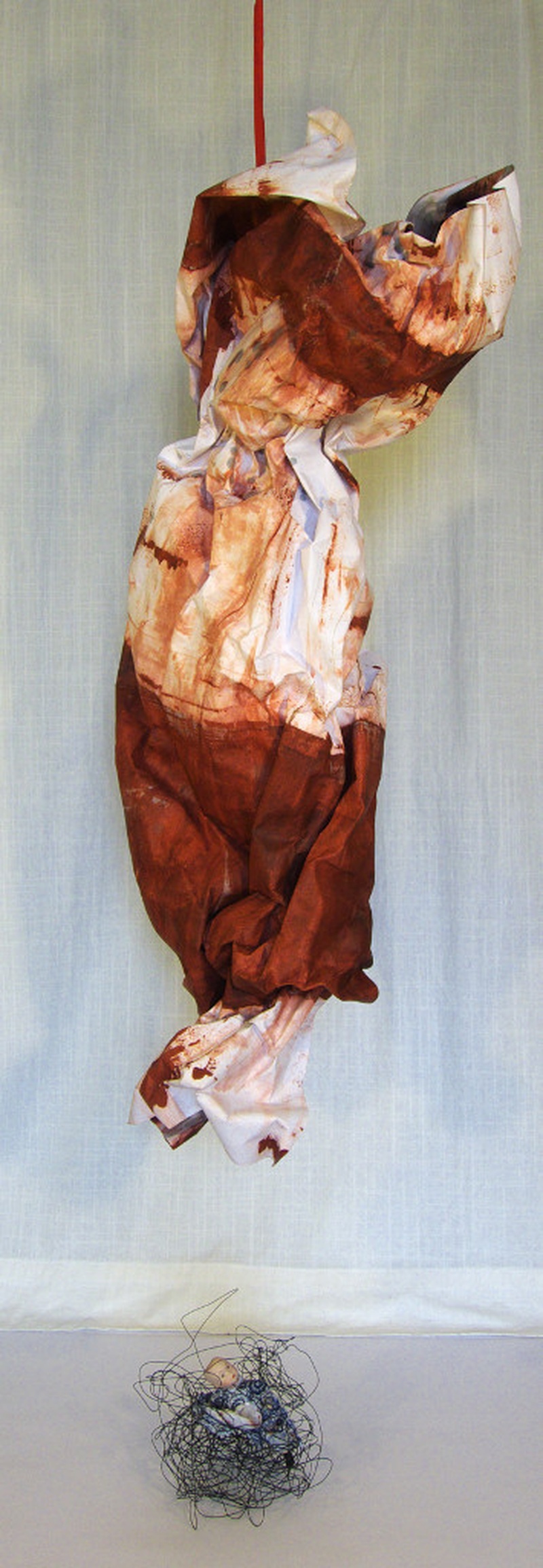
Behold the Lowly Backpack (image 14) encapsulates much of what the exhibition is about. It addresses the fact that the backpack is no longer a neutral, everyday object. An unattended backpack in certain situations could be considered a serious threat. The flag-like object ballooning out of the backpack could represent the extreme beliefs and ideology that would motivate a person to turn the backpack into a bomb. On the other hand, a backpack carried by a refugee could carry all her worldly possessions. Thus, the backpack becomes the seed from which the hopes and dreams of safety and a new beginning can be seen to grow.
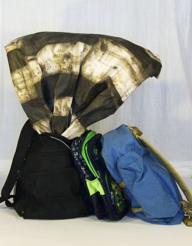
Mixed Media: Watercolour on shaped engineered paper, backpacks
Dimensions: variable
Date: 2015
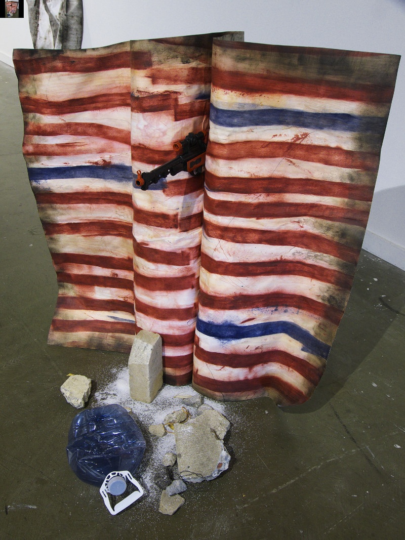
Criminals Drug Dealers Rapists (image 15) quotes Donald Trump’s characterization of many Mexican undocumented immigrants in the United States. This work is a representation of the wall between Mexico and the United States that President Trump intends to build. The flag has the colours of the American flag and is facing the Mexican border. From its folds protrudes a gun. Strewn in front of the flag are concrete rubble, sand and a water bottle. The rubble references the Biblical Jericho, the sand and bottle refers to the difficult desert crossing that some migrants take and the water bottles they all carry. Many perish en route from dehydration and exposure.

Mixed Media: Watercolour on shaped engineered paper, plastic gun, cement and brick rubble, plastic water bottles, sand, New Yorker magazine cover (14 November 2016)
Dimensions: variable
Date: 2016
I offer these interpretations as being one among many. I believe a work of art has a life of its own, independent from its creator.
What kinds of things inspire you?
Of late, I find that it is not just external stimulus that provides inspiration but as important is my state of mind, my receptivity. If I am open and in a creative mindset then inspiration can come from anywhere and anything. All things acquire the potential for art making. Really, the problem is getting into and holding onto that open state. In my experience those elements in daily life that hinder this are having too full of an agenda, having extra concerns on top of all the regular ones we have to deal with, as examples. The things that help me become creatively primed, so to speak, are a set schedule, music, poetry and a fair amount of solitude. I mention poetry because I find it closely related to working with text art in that both must choose words carefully and the words chosen are often packed with layers of meaning.
Did you always see yourself as an artist? What do you hope to accomplish as an artist?
I have always had a strong desire to make things and felt great satisfaction in doing so. As an artist I hope to let what is inside out and thus fulfill my artistic vision. That is the first and most important step. Exhibiting and having people react favourably to the work are also very important but secondary.
Are you happy with the label of “watercolour” artist? How might your art be described differently? How do you describe yourself as an artist? How are you evolving as an artist?
I am dedicated to the medium of watercolour but I find the label very limiting. Because of watercolour’s long tradition and an establishment determined to maintain and protect that tradition at the cost of difference and innovation, the public has a strong preconceived and stunted notion of what kind of art you make when you say that you are a watercolourist. That art being composed of relatively small works, presented beneath glass, of a predominantly representational nature and having a distinctive look compared to works in acrylic or oil. My work on the other hand, tends to be large, is often presented unframed, may have a dimensional element and uses a darker palette than most watercolours. Other characteristics of my work are the use of text, abstraction and having a minimalist nature.
In the future, I would like my art to be more reactive to the environment in which it is to be shown. For example, in the exhibition at the JCCC Gallery, I formed one piece in the gallery using something from gallery storage. The idea of not controlling all aspect of art making and letting a work interact with what surrounds it appeals to me.
Any reflections on the past JCCC show?
The JCCC Gallery exhibition was satisfying on different levels. From a professional standpoint, this was the first show in which all the pieces I displayed were three-dimensional in nature. Many of the pieces had never been shown in a gallery setting before which made it seem as if I were seeing them for the first time. Also, I was pleased to put on public display, at least once, a work that has a contemporary political context which could lose its relevance if circumstances change.
On a personal level, it was a great pleasure to work with other Japanese Canadian artists. Fellow artist, Heather Midori Yamada, curator/artist and organizer of the show, Bryce Kanbara and myself seemed to shared a similar attitude and that was to show up, fulfill our commitments and get the job done with a minimum amount of fuss. I do not know whether our common outlook was a generational thing since we were not too far apart in age, or a belief in professionalism in the arts, or a cultural characteristic of being Japanese Canadian. It was probably a bit of all these elements.
For more information about Warren Hoyano check out warrenhoyano.com.
© 2017 Norm Ibuki